Thursday, November 5, 2009

Street Art Takeover


You may have seen articles the past couple of weeks about Public Ad Campaign, an organization that brought together artists and activists to reclaim some 20,000 square feet of public space from illegal advertising.

Along with white-washing eight sites, here is what I contributed.


Tuesday, November 3, 2009

Crimes, they are a-changin'

I've begun several posts defending the importance of 90s graphic design, but never finished them because they've grown into wild and rambling tomes, attempting to bridge too many subjects. The latest attempt got close, and then Ellen Lupton went and wrote a piece for Print Magazine that sums it up much better than I could. Go read it.

I've been a designer long enough to recognize that fastly-held beliefs as to what is and what is not aesthetically appropriate tend to wane over time. While there are tons of type crimes I consider Never Okay, I still believe that a really good designer can make most things work as long as they address a concept.

That said, I was just flipping through Jan Tschichold's The New Typography, realizing I've never read it through, when it occurred to me that I probably never finish it because the type in my edition is ugly and incredibly hard to read. My paperback edition was printed by University of California Press in 1995 and the notes on the design in the back read:

"The text was set in 7.75 Imago Light Extended with 11.6 point leading. The typeface was revised by extending its overall set widths by 112 percent; character spacing was expanded to a Quark XPress tracking value of 16. Display fonts were set in Frutiger Ultra Black with a tracking value of 19."

In other words, they horizontally stretched a font that was probably too light to begin with, set it small and with too much leading, then fully justified the paragraphs. That's...like, impossible to read. Also, Goudy was the one who personally insulted anyone who would think of letterspacing lowercase, so it's not just my beef.

So I'd like to clarify that 90s typography was not a particularly great result. It was its transparency of process and its exploration of expression that was a necessary juncture in graphic design. It was messy, but messy in the way a desk covered in art supplies is — gratifying.

Wednesday, October 21, 2009

Graphic Designer/Customer Service

I hate this crap.

Printing company seeks graphic design/production person to work with customers on their printing jobs. Deadline-oriented, great customer service skills & punctual. Must be proficient in Quark, InDesign, Photoshop & Illustrator. Salary: under $35,000

Shouldn't job outlets like Media Bistro (where this listing was found) be a bit more discerning? It is insulting to our profession that they would support a company's assumption that graphic designers double as customer service representatives. It's not only an example of a company that places little value on design; it's also a company trying to get two jobs out of one person, for the price of one low-paying position.

It can only end badly: the people who would apply for this job are either administrative assistants who may have learned some software and therefore feel qualified to be designers — thus contributing to more crappy design in our environment; and then there are the recent design graduates who are desperate for work in an economy that isn't hiring people with no experience. So you've got new designers who may well be really great juniors, second-guessing their own self-worth and thinking, well, at least it's a design job.

Tsk tsk, Media Bistro.

Friday, October 16, 2009

Institutionalized: The Loss of the Library

New York Public Library on 135th Street, Harlem

Perhaps because — like the post office — the library was an institution I embraced as a child, I feel compelled to defend it; like defending books in a Kindle-loving world. I love that nearly every town in America — and most of the Western world — has a library. It seems like one of the few commonalities we can have with cultures that are otherwise totally different from our own. Early on libraries obviously filled a community need to educate outside of children's schools. They became natural meeting places and universally-accepted quiet zones. They became public venues for thinking. Imagine that! These days there are very few places you're allowed to go for free. Everything has to be sold. While research largely no longer needs to be done within libraries, it doesn't negate the importance of these kinds of spaces.


New York Public Library, Fifth Avenue


Libraries also make a big difference in how a person discovers information. Nearly every project I start for a client begins at the library. I can wander in, plop down on the floor in front of a section that looks interesting, and browse. Browsing in a library is nothing like browsing on the internet, because your leaps of what to look for are not coming from within. The library has curated this process for you.

For example, I was designing a book cover last year for a textbook on Punishment & Sentencing, which isn't exactly my area of expertise. I cruised through crime, and law and some vaguely ominous prison books before my eye wandered to the next shelf perpendicular, which held the large art monographs. I picked up a book on Louise Nevelson, another childhood favorite, and began reading about her theories of space and confinement, and her explorations in monochromatic texture. I was immediately drawn to these notions as being illustrative of the criminology book. I checked out the monograph, plus several other possible references (for free!) and made my way home to get to work.

Even the freight entrance is lovely


People pay a lot of attention to how we get to the content of things, which is why Kindle has so many supporters. The problem for people like me is that visual people need visual stimulants in order to successfully retain information. I remember what I've read and can access it later in my mind because I am always conscious of how the words looked on a page. I think about books I've read and in my mind I pull up an image of my bookshelf and scan it for help in research. And even while web sites may be designed differently, with different colors and fonts and simulated textures, I don't necessarily recall my Firefox history because it isn't something I walk by in my house every time I go to the kitchen.


A library somewhere on the Upper East Side, New York

Even though the libraries here in Harlem are pathetically under-resourced (I've vowed to donate all of my art books to them in my will, if libraries still exist when I'm dead) I do love that they're still these welcoming, warm spaces. At least people can look for jobs, or use the internet, or sprawl their books over the vast old tables and read with good lighting and high ceilings. I am a bigger believer in needing good space to study in; while libraries have lots of things to look at, they are remarkably devoid of distractions like low light or television screens. Such is the nature of their design.

To bring up Kindle again, one of the biggest flaws I find with it is that it doesn't address any specific brief for readers — its invention was a way for publishers to cut costs, not to offer advantages to consumers. I doubt there was an overwhelming number of people who said they needed to have a selection of 10,000 books with them for their commute to work, or people who said they would read more if only they didn't have to turn pages. All that technology and hype, and each "book" is only a few bucks cheaper than the real deal in paperback.

I realize I tend to sound like an old curmudgeon when I write about these things, but I just think so much of this is short-sighted. Libraries and books have hundreds of years of thinking behind them. The legacy of these beautiful buildings quietly shows that.

Accepting my first design award at age 11,
for a bookmark design contest at my local,
The Baldwin Public Library


Wednesday, September 30, 2009

Outside My Window

Working from home has its perks — a fridge, pajamas, all of my books — and its downsides — isolation, complacency, sloth, procrastination. I've found that I have the ability to work both tremendously well from my lovely home desk as well as tremendously badly, depending on my mood. But the biggest factor seems to be that days when I don't go outside before 3pm generate the most boring work. So I've now vowed to go for an hour-long (at least) walk once per day. It gets my blood flowing, my thoughts churning, and I get to explore the streets of Manhattan.

Here are some snaps I took during yesterday's walk, from my house in Harlem down to 82nd and Broadway.


This doorway was so wonderfully textured, and I couldn't help but wonder whether these types of individual small businesses even have a chance of surviving anymore. I know I try to support small and local businesses as much as I can, but I also know that big companies consistently undercut mom-and-pop prices, rendering them unable to compete.

I just thought this was funny.


And is this a District 9 thing?


Some buildings along Marcus Garvey Park:


Pretty script.


Central Park North:


The Children's Aid Society Logo:


I've seen a lot of logos emulating this as of late. The sort of 3-D-Lego-Rubiks-Cube look, only I've seen it most recently as a system for lettering. I'm not a huge fan of the recent stuff as it smacks of trendiness and doesn't seem like it will have much longevity. I did a quick look around for the history of this one, to no avail. But I'd guess it's from the 80s, and the building block nature of it, and being two-color, gives it some relevant heartiness.

This amazing Art Deco theatre on Broadway is for sale...


Next post: LIBRARIES.

Monday, September 28, 2009

How to Brief a Creative Part Two: Using Real Words.

Several months ago I got a design brief from a fellow designer whose clients didn't like the first round of logos he had created for them, so he (weirdly) hired me to come up with some new directions. His brief to me included these excerpts:

Requirement: Logo and Branding Opportunity: Expansion of the [company name] brand. Alternate revenue stream. Existing infrastructure What is our unique proposition? Edgy and premium quality service at a competitive price point. What allows us to say this? We have the infrastructure already in place to deliver that promise. Tone: Vibrant, bold, edgy Channels: TBD

Good lord. If designers talk this way now, we're all in trouble. The main problem with this brief of course is that you could apply this 'description' to anything and nothing. There's nothing tangible and it really doesn't seem like he (or perhaps even his client) was sure of what they wanted. When designers get briefs like these, they end up engaged in a 'guess and check' situation, often leading to a 'search and destroy' situation. The designer is now in charge not only of the answer, but the question too. The resulting work will seem vague rather than thorough, and no one will come away happy.

Designers aren't marketers, so using marketing vernacular to describe your message won't be as helpful as doing some legwork prior to the briefing. You should be able to describe your product or service in laymen's terms. When in charge of creating my own message for projects, I try to create a synopsis that I can describe in about 15 seconds to most anyone. The effort involved in this exercise is well worth it, because while it defines your message in easily articulated terms, it also means that the brief is less likely to change throughout the design process. Think of it like a mission statement.

Ideally, a creative brief is best built with input from the designer that includes some flexibility for the outcome, but the initial briefing process needs to explain your message from the angle of how you want your audience to perceive it. This means that you should check the words, "I like..." at the door. It's not about your personal preferences any more than it is about the designer's.

Most of the time, a project evokes something in its audience. Explore the sentiments your project should convey to the people interacting with it. Use words that actually mean something rather than buzz words whose meanings are elusive. Make lists of these words and the things they make you think of. Ask yourself whether those conclusions are objective.

To this day I don't understand what I was supposed to do with the 'brief' above (what do they even mean by "channels"?)

A new logo is not going to increase your revenue stream in any quantifiable way,* and any designer who promises that is asking for unwarranted accountability when the client comes back asking for hard proof of return on investment. Unfortunately, I think that in looking for some stability in the marketplace, some designers imply that there is something inherently commercially strategic about graphic design. I just don't think that's true. Obviously with enough research and marketing efforts, business findings can inform how a logo is designed, but ultimately, I don't think that's the designer's job.

*Update: Last night I attended an AIGA event, where Debbie Millman discussed Sterling Brand's redesign of the Tropicana packaging. In the presentation she basically refuted everything I've written in the last paragraph here. Not only did they create a fully, unabashedly commercial strategy in the redesign, Tropicana sold 600,000 more units of orange juice as a result.

I stand by my statement that graphic design is not inherently commercially strategic. But Sterling Brands certainly proves that you can make it so.

Monday, September 14, 2009

Institutionalized: Saying Goodbye to Post Offices

Above: Art Deco letterboxes in the Chicago Stock Exchange


I just came from the post office, a place I visit at least once, if not a couple of times per week. Despite the occasional insanely mean postal employee behind the counter, I've almost always found a certain peace in the ritual of visiting the post office. When I was a kid it was something grown-ups did, so it felt important that I could run my own errand. Back then stamps were 29 cents, which was well within my means (candy at the corner store was 45 cents.) I loved choosing stationery and selecting a pen and setting to work. Then there was the mystery of dropping the letter into the blue box, followed by the gratification of getting a phone call from my grandmother thanking me for the letter a mere couple of days later. She once told me that the sign of a good woman was good penmanship, and I took that to heart.

On top of being infatuated with stationery and in love with critiquing my own cursive, I write a lot of letters as a self-righteous form of procrastination that few can argue with. So I buy a lot of stamps, and I've been doing that for more than 20 years. The United States Postal Service just raised the price of a first class stamp to a measly 44 cents. I could not believe my ears when I actually heard people complaining. I can't even think of anything else that cheap, let alone something that provides so much bang for its half-a-buck.

This afternoon I sent three small packages to Australia. I waited in line approximately 13 minutes, and paid a total of $9.76 for first-class service. No wonder the post office is going broke!

Standing in one particularly long line one afternoon at my local 125th street post-office, I got chatting with the woman in front of me about what it means now that the postal service is closing branches.

"We grew up with post offices around!" she exclaimed, "it's just not something I ever thought would go away."

"Same with newspapers," I interjected, and told her how my grandmother was shocked—almost hurt—that her evening paper no longer gets delivered every day.

"And you know, these younger generations," she nodded toward her daughter in front of her, "they don't know how to talk to the people around them. They can email. They can text. But they don't just strike up conversations. That's considered weird, or unsafe," she observed.

She was right. The post office line is a part of every community, and its elimination is just one more thing that forces a community indoors, apart from each other, unable to tolerate those around them. It's true that we stood in line for at least 45 minutes that afternoon. But I hadn't spoken to anyone else all day, because I'd been sitting in front of my computer, working at home. The more we talked, the more parallels we seemed to draw. The virtues of older generations—patience, manners, kindness, gratitude, thoughtfulness—were all represented by a trip to the post office, and were systematically being stripped away. And for what?

I still have a few pen pals, and getting a postcard from them in my mailbox after a long day is such a welcome token. Taking the time to sit down and write a short letter provides catharsis, serving as a reminder to slow down for a moment, to phrase your sentiments carefully, and to practice your penmanship.

Sunday, September 13, 2009

Crikey! The Truth About Type Obsession

R
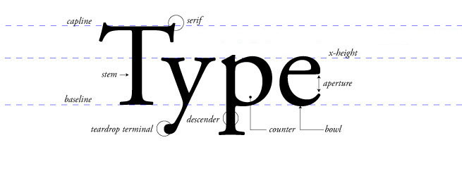
ecently I was asked by a journalist for some advice: she was writing an article on "the excesses of type nerdery," and wanted to hear my take in light of the (completely over-dramatic) fray over Ikea's abandonment of Futura in its catalogues in favor of Matthew Carter's ubiquitous Verdana.

First of all, I don't really care about Ikea; I mean, I think it was a poor choice to choose Verdana—a font designed for the screen, not print and signage—and I understand that some designers think it was a bit of a "fuck you" to type designers when Ikea is supposed to be about presenting good design to the masses. I'll concede that there were some people whose reactions were bizarre (evidently someone started a petition against it.) But I'll parrot Steven Heller on the matter when he said that "some people just have no lives," referring to the uproar on the web. Another good point he made is that while Verdana was not a good design move, Futura is a pretty poor face for setting text, especially in a thing like a catalogue. So it's not like Ikea's design choices were ever the pinnacle of graphic design.

The thing that seems to be playing out here though, is not so much that designers threw some huge temper tantrum over Ikea's decision—it's journalists who noticed online type forums light up in discussion, who then exploited designers' technical reactions to twist the whole thing into a story about how fascist typographers are.

It may seem to people who aren't involved in design and typography that our online discussions about bad kerning or whatever—which, by the way, usually aren't directed at people outside our own community of nerds—are trivial and frought with "irrational hatreds." I'll concur that designers' love for the study of type can be extensive. Some are even excessive. But "irrational"? Not at all.

For those of us who revel in the discovery of found lettering, or who can spend hours and weeks adjusting the curves and strokes of a single letter during the tedious process of designing of a font, naturally our observations will be keener than the layman. But there are analogies aplenty to prove that most passionate people have a critical eye: a chef would surely balk at a chain restaurant's decision to swap out aged cheddar for Velveeta. A record collector wouldn't appreciate you comparing your downloaded mp3s to his lifetime's accumulation of vinyl. A textile designer would advise wool over linen for a winter coat. What's wrong with that?

When the aforementioned journalist approached me for comment, I pointed her in the direction of some interesting, beautiful and painstakingly gathered collections of type ephemera by some of the world's most respected and talented type designers. I remarked that while the common way to rib a designer is to mention Comic Sans (I jokingly started a facebook group last year about how organic food companies should embrace a new font), it's not really about a What's Hot/What's Not list of the season's top fonts—although that one-dimensional kind of 'reporting' does seem to be all these bloggers can come up with.

The articles that cry 'crazy' upon reading forums on Typophile support some notion that designers' passion, specificity and wealth of knowledge is something to be ridiculed. They're just the jocks picking on the nerds. Considering most of them are poorly written and haphazardly researched, they might do well to take a page from the nerds and study before claiming they're ready for the test.

Tuesday, July 21, 2009

Letters from Lake Tahoe

In no particular order...