Yessss! My blog is finally (after a zillion years of not having this capability on any of my sites) incorporated into The Letter Office's site!
Visit us!
Wednesday, January 19, 2011
Saturday, January 8, 2011


Thursday, October 28, 2010
Function Following Form

By the always-fantastic Oslo Davis
 've touched on this before, in my post about my love of libraries, but the recent influx of opinions and analyses regarding content for e-readers compelled me to throw in my two cents.
The biggest problem with e-readers—which is to say, devices specifically formatted for reading books and publications, since the iPad has other uses as well—is that they are a product designed for the makers' gain, not the users'.
The publishing industry did not start to sink because readers thought carrying a book with them made their bags too heavy, or that they wanted more of a variety for their daily commute, or because they thought that books and magazines simply took up too much space in their houses. Book and magazine content is not music, despite the repeated and stubborn attempts to make their futures synonymous.
As Khoi Vinh (former design director at the New York Times) touches on in his recent article, e-reader manufacturers and those they charged with populating the machines with content, are barking up the wrong tree. As long as they continue to attempt to make e-readers a substitute for print, they will continue to fail. Take, for example, the number of articles alone dedicated to screen lighting, typography, and note-taking—all aspects of books that simply aren't an issue in print. Their attempts to create a machine that somehow bests the traditional medium only gives them more problems to try to solve.
The promise that e-readers are somehow going to save publishing stems from one thing: advertising dollars. Periodicals are folding by the day, and the primary instigator of that is a massive loss of revenue to digital platforms. Fine, conceded. But the knee-jerk reaction that seems to be the impetus for the advent of e-readers—make periodicals digital too—seems creepily like allowing the client to art direct the format.
As for book publishing, there were far more, less transparent issues at play. Brick-and-mortar mega bookstores took over the industry, got too big, diversified their inventory too much (by adding music and cafes and toys and Christmas gifts and Burt's Bees hand cream and, as my mother-in-law calls them, "books for people who don't read".) And then they were shocked when the recession hit and this model of business was not only unprofitable, it is unsustainable.
In another instance of relinquishing creative control to the client, mega bookstores then bullied their ways into publishers' marketing departments, dictating everything from content they would and would not carry or support, to the design of book jackets. (Ever wonder why 50% of literature written by women now seems to sport a pink, sparkly high heel on the cover?) And now we find that the retail cost of e-books is nearly on par with their printed versions, making it even more obvious that this is about making publishers money, not expanding or improving the publishing industry. Publishers=1, Writers, Printers, and Everyone Else=0.
I've digressed. But the point is, e-reader manufacturers can continue to thrust the 'problem' (there was no problem with books or magazines as formats) into the hands of otherwise very capable innovators. But until they sort out what that problem ever was, they will likely never find a solution.
Tuesday, September 14, 2010
A Letter I Have Written...
...And Really Want To Send To This One Copy Editor:
Dear XX,
I feel compelled to write you after what was truly a frustrating and demoralizing process of working with you on this [project]. While I respect your expertise as a copywriter, it seemed time and again throughout the process that you assumed a responsibility to art direct my work, rather than respecting the established team in place — my creative director included.
Your utterly unconstructive comments, "this isn't doing it for me" and "reminds me of a brochure" not only dismissed the creative decisions we make as professional designers, but put us in the uncomfortable position of trying to ascertain what was actually legitimate critique and what was coming from your own aesthetic and/or assumption of control over the creative process. Following up that drivel with notes like, "Looks great!!!!" only added to the condescension.
Unfortunately I am working within an organization that does not value its creative staff; under better circumstances, my defense of my work and the reasoning behind the typographic and other visual decisions I make would not have been trumped by your uninformed commentary, all of which has ultimately led to the mediocre and compromised result we are sending to print today.
I'm writing because I suspect that throughout your career, designers like me have also wanted to tell you precisely what I have, but have lacked the ability, position, or confidence to do so. Or perhaps they have more tact, which is certainly more than we, as designers, can say for writers like you.
Wednesday, May 12, 2010
New Kids and the Block

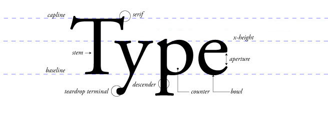
I hate to pin this all on you -- surely we have more experienced culprits too -- but this trend is really wearing thin. It's an understandable reaction when one discovers type, to experiment with removing counters, exploring width and legibility, constructing alphabets out of a single geometric shape, and asking 'what makes a letter a letter?'
But it's important to note that these types of typographic experiments were kinda already nailed in the beginnings of the last century during Dada, deStijl, Bauhaus, Russian Constructivism... with (usually) a much higher level of craft and meaning. It's great to explore these things for yourselves, but passing them off to clients is a little embarrassing in their lack of substance and seeming naivete about the history of type.
At the very least, this level of trendiness lacks longevity, and is obviously played out. I collected a few of these to show some students, but I think I'm just going to start screen-grabbing them until we've exhausted their ubiquity. I like to beat points to death like that.


Sunday, April 4, 2010
How to Design a Book: A Type 102 Review
 was excited for the arrival of Tony Brook and Adrian Shaughnessy's new book, Studio Culture: The secret life of the graphic design studio. The book is a collection of essays and interviews written by some of the world's most revered design studios on what they believe to be the most important and integral aspects of their own studios, as well as their observations on what doesn't make for a positive, collaborative space.
I picked up my package at the post office and tore it open on my walk to the subway. Finding a seat on the train, I settled in to the first page (I read everything, especially in design books, starting at looking at the binding and endpapers, and moving on to one of my favorite parts, the imprints page.)
But an uneasy feeling came over me from the very start: the title page was barren, with its information pushed in to the top right corner. Moving on to the acknowledgements, I saw the text was treated much the same way, only worse, because being on a left-hand page the text was now being pushed toward the gutter. Further on to the contents page, I immediately noticed a weird affectation of two long em-dashes, (— —) rather than one en-dash, ( – ) serving as page ranges. Flipping swiftly on to the next page and the next, I started to get irritated at all of the type and layout.
Did an architect lay this out? I wondered. But no, the designers are quite awesome designers — albeit primarily known for their striking posters — working in whatever we're calling neo-Modernism these days. But it seems like nearly all of the design decisions made ignored the essentials of book layout in favor of a "cool" aesthetic. Here's the bottom line: I could not read this book on the subway. The type and structure of this book is such that you'd better be sitting motionless in natural, or under flourescent light to read it. I teach typography, so naturally the teacher in me kicked in and, having nothing else to do for the rest of my train ride, I composed this, a Typography 102 Review For Designers.
Typographic Color
This term does not get nearly enough attention, perhaps because a lot of designers don't quite understand what it means. Typographic color refers to the range of white – black values on a page. In a block of text, it's the amount of black we perceive; a range of color is achieved through stroke contrast of the type itself (which gives density to the letterforms,) the type's width, weight and point size, and how tightly or loosely one sets the leading.
Below is the same text. On the left is Gotham Thin — a sans serif with low stroke contrast — and on the right is Janson. They're set at the same point size and leading, but you can see how the right column is "darker". If we adjusted the scale, leading, and/or weight, we would see an even greater difference.

In Studio Culture, not only is there very little typographic color, the type is set in a warm gray spot, lowering the contrast even more. Combined with an incredibly small point size, on light gray paper, even those with good vision will strain to read. Other pages have text knocked out of the gray color, which may be nice to read on screen, but can be laborious on a page. Overall we have a lot of gray pages.
Scale and Contrast
As Ellen Lupton says, clients tend to like type too big; designers tend to prefer type too small. Generally speaking she's right, but I would qualify this by saying designers appreciate scale (we also like HUGE type!) and we also like proportion. Studio Culture's type — dare I say it — is too small. I'm certainly not saying that 8pt type (I can't tell if that's what it is, but I'm guessing) is always too small; in fact I think that's often a nice point size for body text. But this typeface has no stroke contrast, it's gray, the leading is tight, the pages have very small top and bottom margins, and the column widths are short. All recipes for too much samey-same. Captions are even smaller.
Typeface Selection
A lot of the problems mentioned above would not be problems if a suitable font had been chosen. It was not. Optimo Hermes was evidently based on a 1969 typewriter face, but something tells me it was not cut this small. Being a typewriter face, it's also monospaced (eliminating, yet again, even more contrast, since we have cut out width variation.) The letterspacing overall is poor, with lots and lots of bad kerns happening, as well as an awkward lack of ligatures. In blocks of text, it is difficult to distinguish an o from an a; when knocked out of the gray the thinner stroke of the apostrophe and quote marks nearly falls out completely.
Page Structure and Other Considerations
The grid is a fairly standard two-column affair, and that's fine, but the only breathing room we're given as readers is that typically only three of the four columns in a spread are used. The margins, as mentioned above, are tight around all edges, which could work if headers or interview questions or whatever were treated in a different way (they are actually just lighter than the body text, which makes one drawn to the answer first and the question second.)
Also employed is many a type nerd's pet peeve: no hyphenation. So now we have a crazy right rag in a tight column, so keeping your eye on the line, yet again, is a problem.
The pages that do feature imagery are also too samey-same, so that when flipping through the book I've no idea which section I'm in. Each new section begins with a left-hand duotone image in the spot plus black, but they are quite dark and do not illuminate (pun intented) what are obviously pictures of bright and sunny studio spaces. The images that accompany the text are mostly quite small, and if this was because of a page limit I think there could have been much nicer ways to handle this. Instead it seems like they could only get 72 dpi images or something — I want to see these studio spaces!
Good Things
From what I have read so far, the texts are quite good, and would be incredibly engaging if I weren't so distracted by all of the above. With the exception of some glaring proofreader misses ('then' instead of 'than', twice in the same paragraph; 'I' instead of 'me') the interviews are personable and honest.
Frankly, if this were another design book with big pretty pictures with supporting text, rather than a book I'm meant to read, I would not have spent my whole morning writing this post. I'd flip through and look at the pictures and peruse the diminutive captions at will. But I really want to read this book, and I eventually will. I just wish I weren't wishing for the Kindle version.
Monday, March 29, 2010
On Process (What's new?)
Here's a good litmus test to assess how good your process is at your place of (design) work:
Write a paragraph or two describing how your project evolved, from its initial concepts to its end result, without writing anything about client changes.
In theory, the work you've produced should still be sound, with its foundation rooted in a solid idea, supported by a framework of visual aesthetics that reinforce it. If the result you've produced is a bit weak, has holes in its ideas, or relies primarily on a visual style to communicate -- well that sounds like compromises in the process were made.
The exercise will allow you to see where exactly that happened in your process, and will help you to avoid those potholes next time.
Subscribe to:
Posts (Atom)